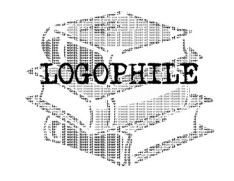
Logophile: What Makes Your Wing Ding?
We’ve all seen it. Floating in the corners of our vision. Hiding in nonsense. But, how many of us have actually stopped and asked the ultimate question: what in the world are “Wingdings”?
Unfortunately, with the alarming amount of time I’ve spent studying Word fonts, I have. And it led me down a dark, dark path where English is no longer English and Wikipedia is as nonsensical as the font itself.
For those of you who don’t play around with font styles to procrastinate writing – oh, an article for example – Wingdings is a font option at the very end of Microsoft Word’s extensive list. “Wingdings” in the Wingdings font is:
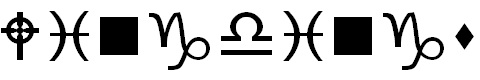
There is also a Wingdings 2 and 3, both as bizarre.
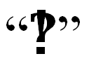
The short answer is that Wingdings is a collection of dingbats. Dingbats are primarily made up of Lucinda Icons, while Wingdings 2 has more Asterism, Interrobang, and Ampersand variations. The comprehendible answer is that it’s where Microsoft put all of the symbols old-school printers used by hand. “Dingbat” is just printer code for symbols, “Interrobang” just a symbol combo like:
Ampersand just versions of “&.” The lower case “w” in Wingdings is the diamond some books use to mark scene breaks, while a “v” makes the four diamonds sometimes seen next to the page number.
The name even has a reasonable explanation. The symbols were said to make a “ding” noise when being placed in the edges, or “wings,” of the book in old printing presses. This is similar to the origins of “cliché,” which is also an onomatopoeia for printing with movable type.
So, no, Microsoft hasn’t been invaded by egotistic birds and bats. There has been no alien invasion. Atlantis isn’t finally contacting us after all of these years.
Excuse me if I’m disappointed.